Benjamin Moore Cape (1474) is a versatile mid-tone gray that exudes understated elegance and sophistication. Perfect for those who seek a neutral backdrop with a touch of depth, Cape strikes the ideal balance between cool and warm undertones, making it an adaptable choice for a wide range of interior styles.
Cape (1474) is a complex gray that leans slightly warm but remains neutral enough to complement various palettes. It features subtle taupe undertones, which lend a sense of warmth and softness. These undertones make Cape feel welcoming without veering into overly beige territory. Depending on the lighting, Cape can shift its character—appearing cooler in spaces with natural light and warmer in rooms illuminated by incandescent bulbs. This chameleon-like quality makes it an excellent option for rooms that transition between day and night.
Benjamin Moore Cape pairs beautifully with a variety of colors, whether you’re looking to create contrast or maintain a monochromatic aesthetic. Some coordinating options include:
Cape (1474) is an incredibly versatile color, making it suitable for a variety of applications across your home. Here are some popular uses:
Cape is an ideal choice for living rooms, creating an inviting and tranquil atmosphere. Pair it with soft white trims and plush furniture for a cozy yet modern vibe. Add accents like navy or charcoal throw pillows for added dimension.
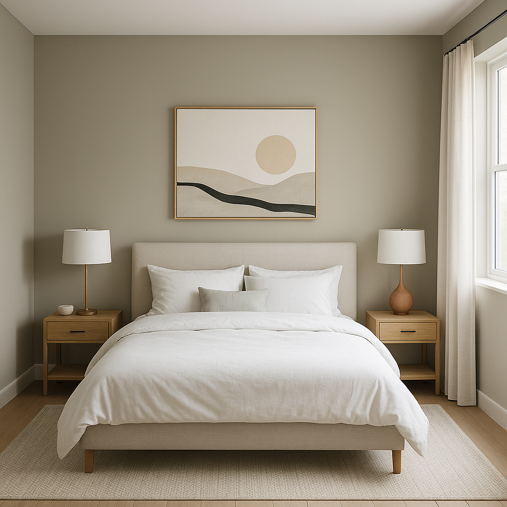
The warm taupe undertones of Cape are perfect for bedrooms, fostering relaxation and serenity. Layer it with creamy whites for bedding and curtains, or pair it with muted metallics like brushed gold or silver for a touch of glamour.
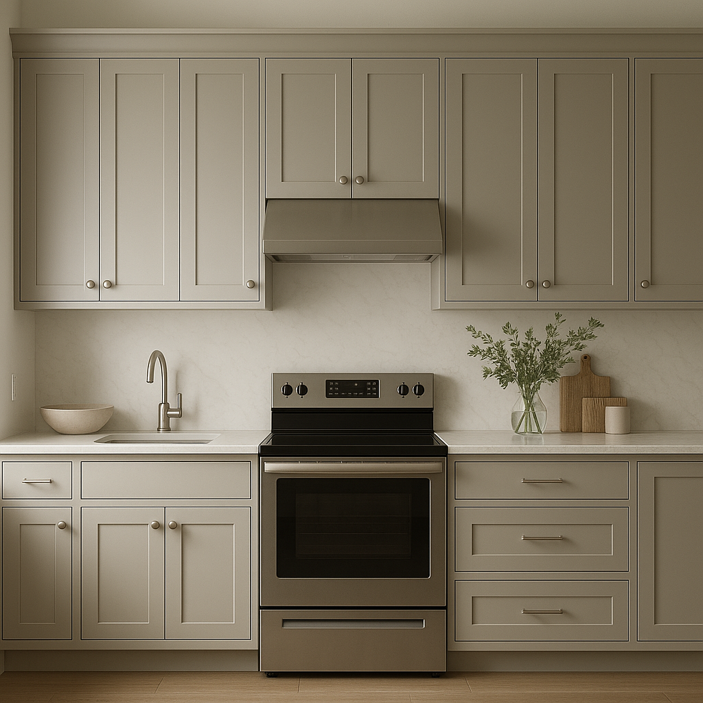
In kitchens, Cape works beautifully on cabinetry or walls, offering a contemporary yet timeless aesthetic. Pair it with crisp white countertops or subway tiles for a clean, cohesive look, or introduce natural wood tones for a farmhouse-inspired feel.
The neutral sophistication of Cape makes it a great option for bathrooms. Use it on walls with white tiles and fixtures for a spa-like retreat, or combine it with darker accents for a more dramatic, moody effect.
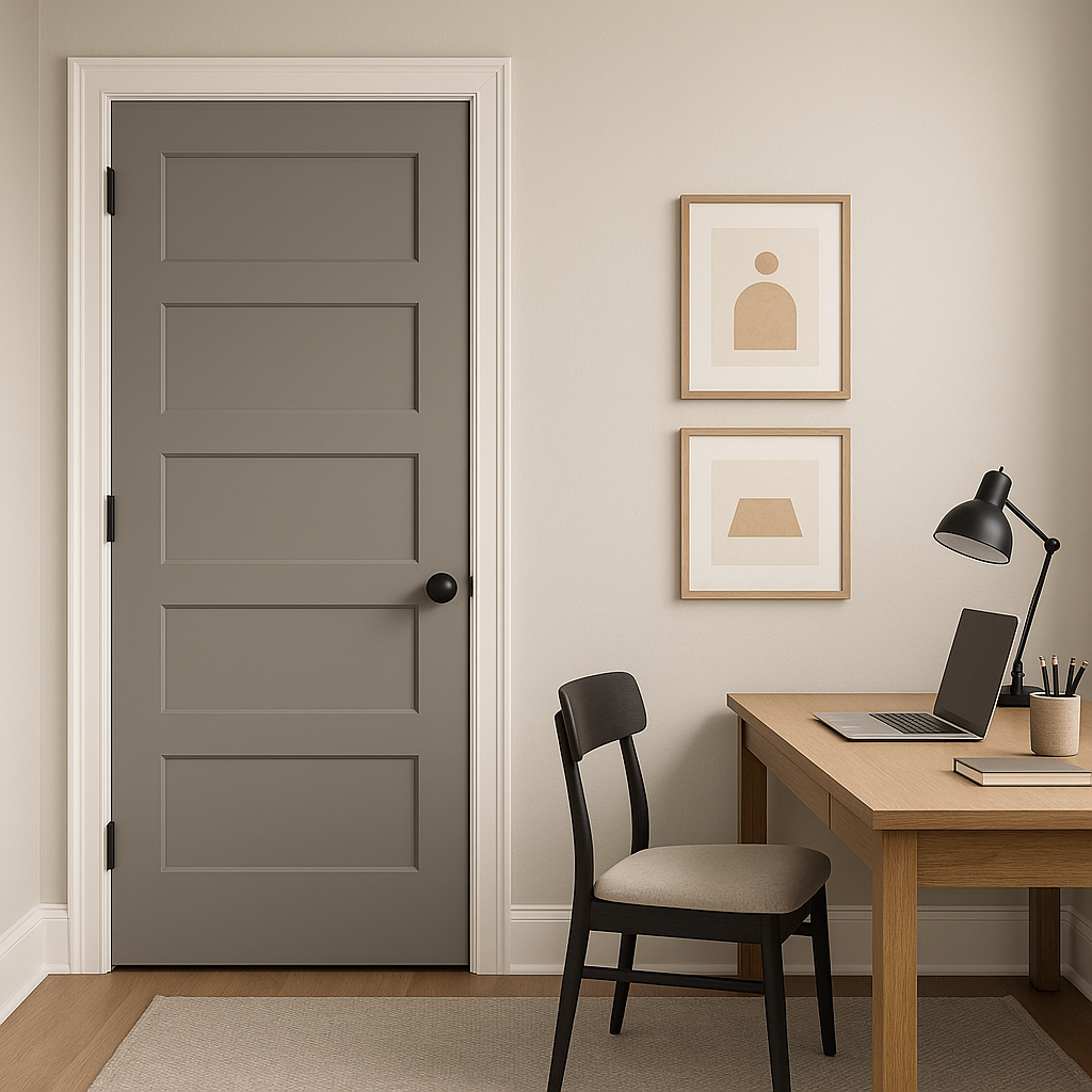
Cape is the perfect gray for hallways and entryways, as it creates a seamless transition between rooms. Its neutral warmth ensures it complements various design styles, from minimalist to traditional.
Benjamin Moore Cape (1474) is more than just a gray—it's a sophisticated neutral that adapts to your space and style with ease. Whether you're designing a cozy bedroom, a polished living room, or a modern kitchen, Cape provides a timeless backdrop that enhances any decor. Its subtle taupe undertones and ability to complement a wide range of colors make it a top choice for homeowners and designers alike, offering both versatility and character in one elegant hue.
View Colors Only by Brand (No Imagery):
Sherwin-Williams
|
Benjamin-Moore
|
Behr
|
Valspar
Live on the Eastern Slope of Colorado and looking for a local painting professional, check out all our painting services and reach out for a free estimate.
Copyright © 2026 : Wild Fox Painting Inc. : 12435 Mead Way, Littleton, CO 80125


