Benjamin Moore Yukon (1439) is a versatile and elegant gray that brings sophistication and calm to any environment. Its balanced tone makes it a go-to choice for homeowners and designers alike, offering a perfect blend of warmth and neutrality. Whether you're rejuvenating a living space or creating a serene office atmosphere, Yukon is a color that adapts beautifully to various design styles and settings.
Yukon leans toward a soft, warm gray with subtle taupe undertones. These understated earthy notes lend the shade a sense of coziness, preventing it from feeling overly cool or stark. The taupe undertones add a slight beige influence, making Yukon an excellent choice for spaces that need a touch of warmth while still maintaining a modern, sophisticated feel. The undertones are subtle enough to complement a wide range of palettes, but their presence ensures Yukon doesn't feel flat or one-dimensional.
The way Yukon reads in your space will largely depend on the lighting. In rooms with abundant natural light, Yukon appears lighter and airier, highlighting its soft gray characteristics. In spaces with dim or artificial lighting, its taupe undertones will become more pronounced, creating a warmer, cozier ambiance.
One of Yukon's greatest strengths is its ability to harmonize effortlessly with other shades. Whether you're styling it with bold accents or complementary neutrals, Yukon serves as an adaptable backdrop. Here are some coordinating colors that pair beautifully with Yukon:
These coordinating colors allow you to create a layered, curated look, whether you’re designing a monochromatic scheme or introducing pops of color.
Benjamin Moore Yukon is as versatile as it is beautiful, making it suitable for a variety of rooms and design applications. Some ideas for incorporating Yukon into your home include:
Yukon’s soothing gray tones create a welcoming atmosphere in living rooms. Pair it with plush furniture in beige or cream tones, and add pops of color through throw pillows or artwork. Yukon is particularly fitting for contemporary or transitional design styles.
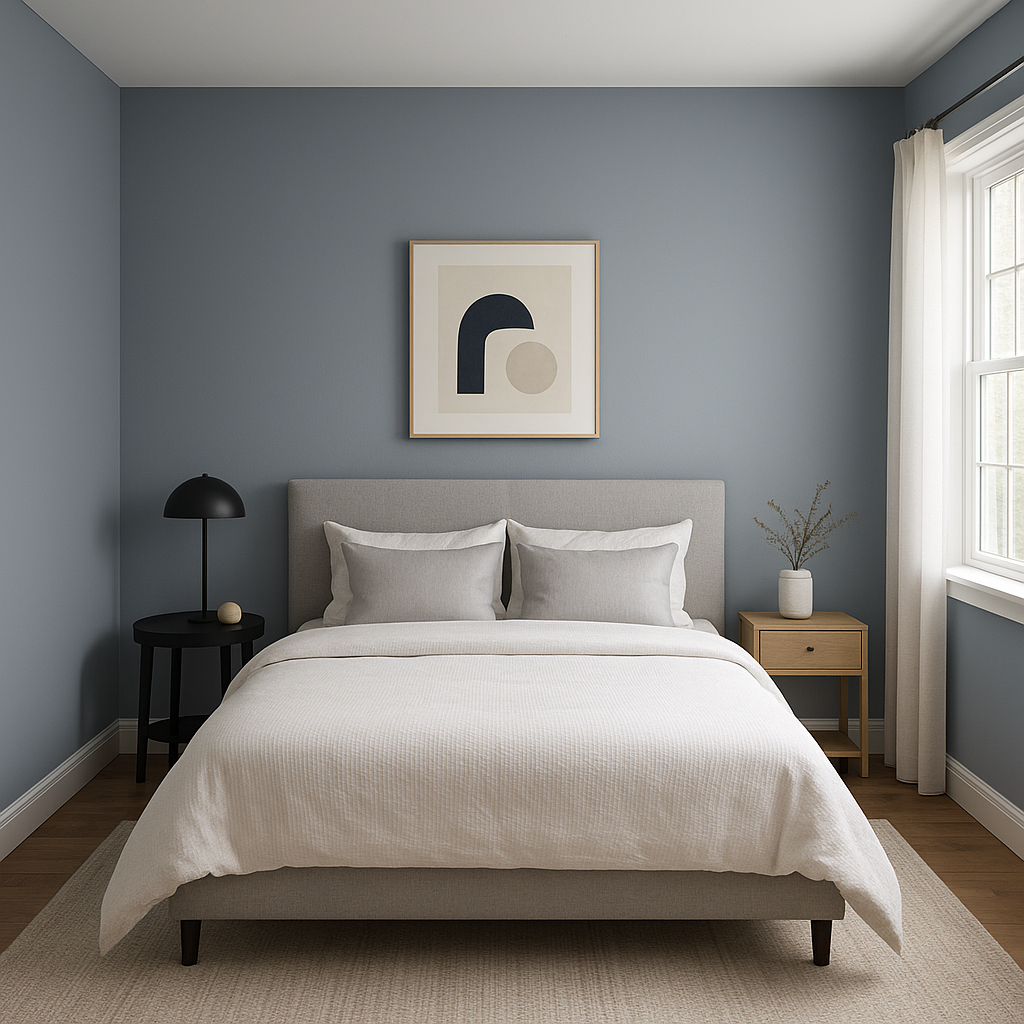
Transform your bedroom into a relaxing retreat with Yukon as the primary wall color. Its warm undertones promote a sense of calm, making it ideal for spaces dedicated to rest and relaxation. Pair it with crisp white bedding and natural wood accents for a clean, serene look.
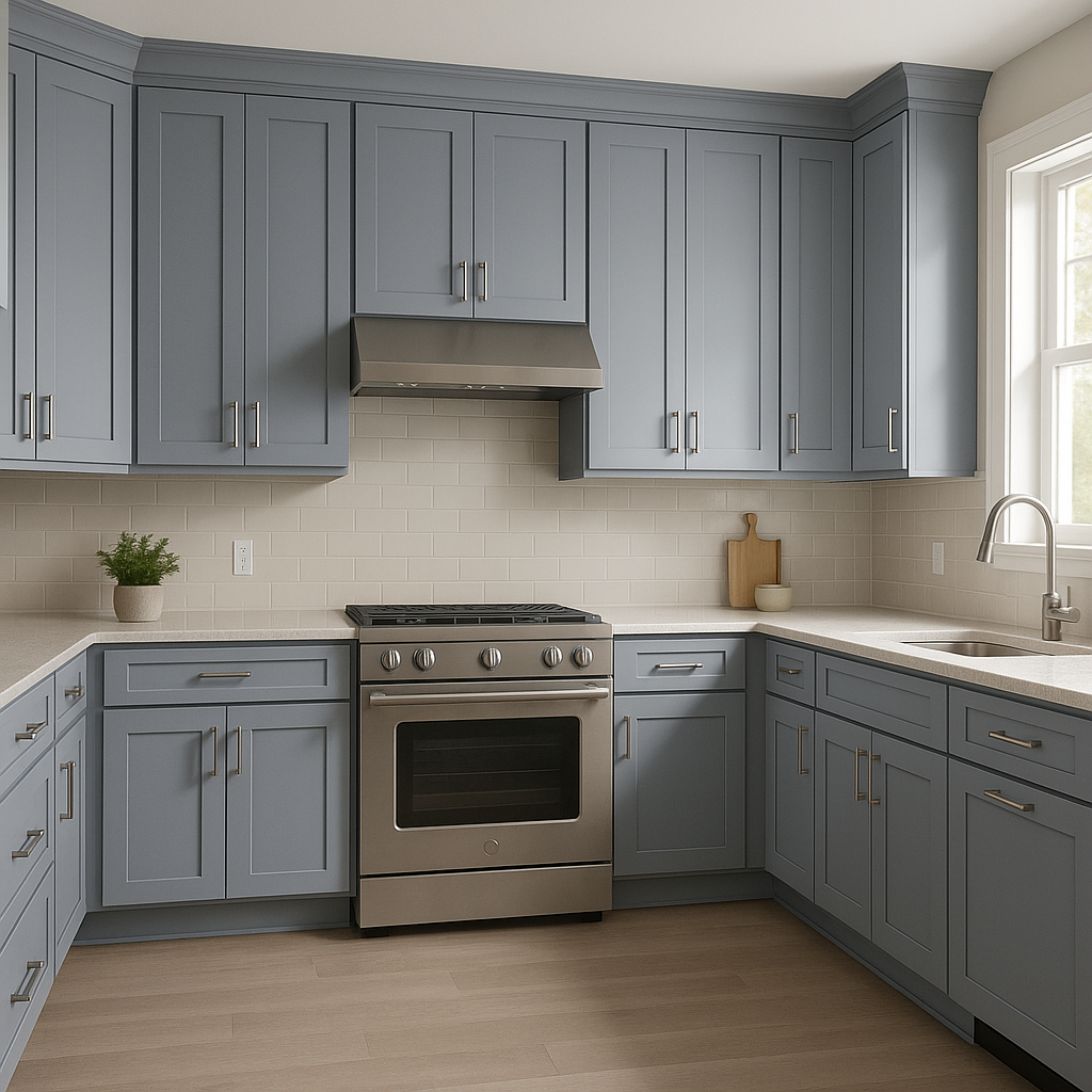
For kitchens, Yukon works wonderfully as a wall color or even on cabinetry. Combine it with marble countertops and brushed nickel hardware to achieve a modern yet timeless aesthetic. Yukon’s warmth ensures it won’t feel sterile in a kitchen setting.
Yukon is an excellent choice for bathrooms, especially when paired with bright whites and silver or chrome finishes. Its gray tone lends a spa-like quality to the space, making it feel fresh and tranquil.
In an office, Yukon fosters focus and calm. Pair it with darker grays or navy blues for an elegant, professional look, or keep it light and airy with white accents.
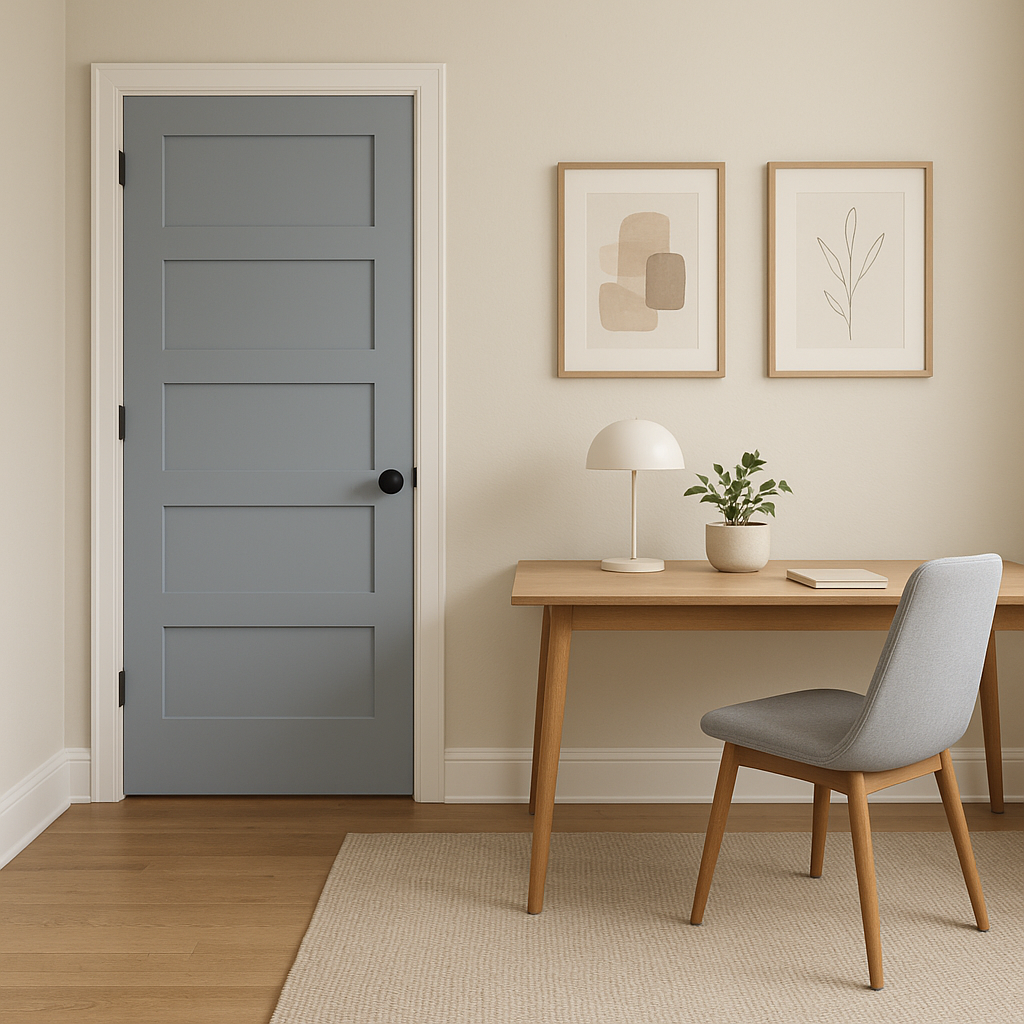
Yukon can also be used as an accent color for furniture pieces like cabinets, bookshelves, or built-ins. Its understated elegance enhances the overall design without overpowering the space.
Benjamin Moore Yukon (1439) is the epitome of versatility, warmth, and timeless sophistication. Whether you're designing a cozy bedroom, a chic kitchen, or a professional office space, Yukon adapts effortlessly to your needs while enriching the ambiance of the room. Its ability to pair seamlessly with other colors and its balanced undertones make it a standout choice for any interior design project.
View Colors Only by Brand (No Imagery):
Sherwin-Williams
|
Benjamin-Moore
|
Behr
|
Valspar
Live on the Eastern Slope of Colorado and looking for a local painting professional, check out all our painting services and reach out for a free estimate.
Copyright © 2026 : Wild Fox Painting Inc. : 12435 Mead Way, Littleton, CO 80125


