Benjamin Moore Brighton (1291) is a soft, inviting color that epitomizes serenity and understated elegance. This light, airy shade is part of Benjamin Moore's extensive collection of timeless paints, offering a versatile option for a wide range of design styles. Its subtle presence brings an effortlessly fresh and tranquil atmosphere to any space, making it a favorite among homeowners and designers alike.
Brighton (1291) is a pale, muted green that leans slightly toward the yellow spectrum, giving it a warm and approachable quality. The undertones are delicate, with hints of sage and a whisper of gray, which balance its warmth with a touch of modern sophistication. These undertones make Brighton a versatile shade that pairs beautifully with both cool and warm palettes, creating a harmonious and cohesive look in any room.
One of Brighton's strongest attributes is its adaptability when combined with complementary hues. Whether you're seeking to create a monochromatic look or add depth with contrasting tones, Brighton pairs seamlessly with a variety of colors:
Neutral Pairings: For a serene and balanced aesthetic, pair Brighton with soft neutrals like Benjamin Moore's White Dove (OC-17) or Simply White (OC-117). These shades enhance the lightness of Brighton while maintaining a clean and airy vibe.
Earthy Complements: To bring out Brighton's subtle green undertones, consider pairing it with warm earth tones like Edgecomb Gray (HC-173) or Revere Pewter (HC-172). These colors add natural depth and an organic feel to your space.
Contrasting Accents: For a bold and modern twist, combine Brighton with deeper shades like Hale Navy (HC-154) or Kendall Charcoal (HC-166). These dark tones create striking contrasts that elevate the overall design.
Soft Pastels: To achieve a delicate, harmonious palette, pair Brighton with pastel colors such as Palladian Blue (HC-144) or Wickham Gray (HC-171). These shades work wonderfully in creating a soothing and cohesive look for bedrooms, nurseries, or bathrooms.
Brighton (1291) is a highly versatile shade that works beautifully across a variety of applications. Its refreshing and calming qualities make it an excellent choice for spaces where you want to promote relaxation and comfort:
Living Rooms: Brighton's soft green tones bring a sense of calm and balance to living areas. Pair it with natural wood furniture and light fabrics for a cozy, inviting space.
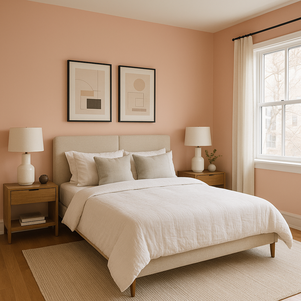
Bedrooms: As a soothing, muted green, Brighton is a natural choice for bedrooms. Its tranquil vibe sets the stage for restful sleep and pairs beautifully with light linens and understated decor.
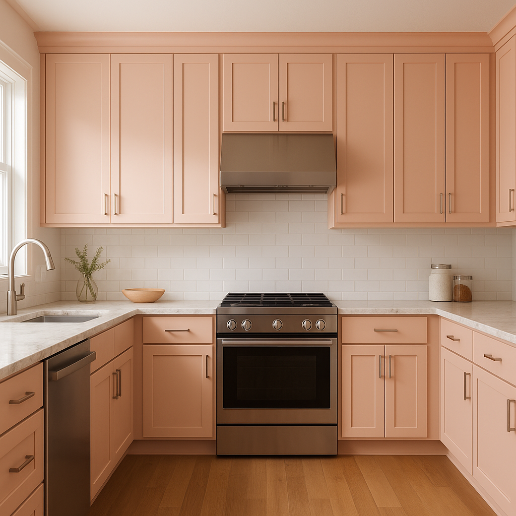
Kitchens: Brighton can add a fresh, clean feel to kitchens, especially when paired with white cabinetry and brushed nickel hardware. Its subtle warmth makes it perfect for spaces that feel both modern and welcoming.
Bathrooms: The soft green undertones of Brighton evoke a spa-like atmosphere in bathrooms. Pair it with white or light gray tiles and chrome fixtures for a fresh, contemporary look.
Entryways and Hallways: Brighton's lightness makes it an excellent option for entryways and hallways, creating a welcoming and open feel as soon as you step into the home.
Outdoor Spaces: Use Brighton on exterior siding or trim to create a timeless, nature-inspired facade. Its soft green undertones blend beautifully with landscaping and natural surroundings.
Benjamin Moore Brighton (1291) is a stellar choice for those looking to infuse their spaces with a gentle, refreshing color that complements a wide range of design styles. Its subtle green undertones, remarkable versatility, and ability to coordinate with both neutral and bold palettes make it a go-to paint color for creating tranquil, sophisticated interiors and exteriors. Whether you're designing a minimalist retreat or a cozy, traditional home, Brighton offers the perfect balance of charm and adaptability.
View Colors Only by Brand (No Imagery):
Sherwin-Williams
|
Benjamin-Moore
|
Behr
|
Valspar
Live on the Eastern Slope of Colorado and looking for a local painting professional, check out all our painting services and reach out for a free estimate.
Copyright © 2026 : Wild Fox Painting Inc. : 12435 Mead Way, Littleton, CO 80125


