
Benjamin Moore Adobe (1128) is a rich, earthy paint color that exudes warmth and sophistication. With its deep terracotta-inspired tone, Adobe is the perfect choice for creating inviting, grounded spaces that feel effortlessly timeless. This versatile shade resonates with the warmth of baked clay and evokes the natural beauty of sun-soaked deserts and Mediterranean landscapes. Whether used as a focal point or a complementary accent, Adobe's charm lies in its ability to imbue spaces with a sense of coziness and understated elegance.
Benjamin Moore Adobe (1128) carries distinct warm undertones that lean toward red and orange, giving it a pronounced terracotta character. It’s neither overly bright nor muted, striking a perfect balance for interiors that aim to feel classic yet modern. These undertones make Adobe a fantastic choice for spaces that benefit from a warm, earthy palette, as it pairs beautifully with natural materials like wood, stone, and woven textiles. Its red and orange hints ensure the color feels vibrant and full of life, without being overwhelming.
Adobe’s versatility shines when paired with complementary shades that enhance its warm undertones. Here are a few coordinating colors to consider:
These coordinating shades allow Benjamin Moore Adobe (1128) to fit seamlessly into a variety of design styles, from rustic and bohemian to contemporary and Mediterranean-inspired interiors.
Benjamin Moore Adobe (1128) is incredibly versatile and can transform any space into a warm and welcoming retreat. Here are some ideas for using this shade effectively in your home:
Adobe is a stunning choice for living rooms where comfort and style are key. Use it on an accent wall to create depth and drama while pairing it with neutral furniture and textured accessories such as woven rugs or leather sofas. Its warmth complements wood elements beautifully, making it ideal for spaces with exposed beams or hardwood floors.
In dining areas, Adobe sets the stage for intimate gatherings with its inviting, cozy vibe. Pair it with rich wood tones and metallic accents, such as gold or brass fixtures, to create a sophisticated yet approachable ambiance.
For bedrooms, Adobe brings a sense of earthy serenity. Consider using it as the primary wall color, complemented by soft linens in neutral tones like beige or cream. Add pops of color through throw pillows or artwork featuring greens and blues for a balanced aesthetic.
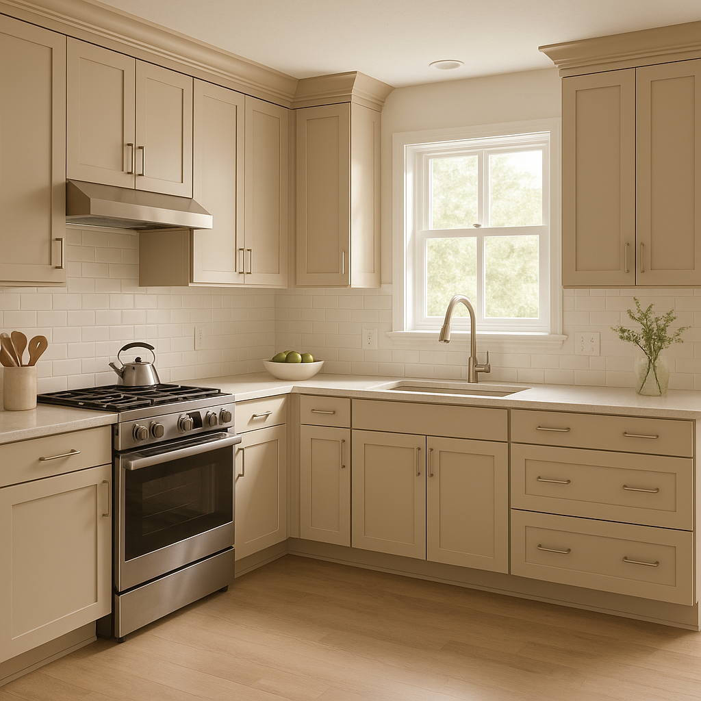
Adobe works wonderfully in kitchens, especially when paired with white or cream cabinetry. The terracotta hue adds a rustic charm reminiscent of Tuscan-style kitchens. Incorporate natural stone countertops and warm metallic hardware for a cohesive look.
In bathrooms, Adobe can create a spa-like atmosphere when paired with soft whites or muted greens. Consider using it on cabinetry or as an accent wall behind the vanity for a sophisticated touch.
Adobe is equally stunning for exterior use, bringing a bold yet timeless quality to facades, entryways, and shutters. Its earthy tone works well with stone accents and landscaping features, making it a popular choice for Mediterranean or Southwestern-style homes.
Benjamin Moore Adobe (1128) is the epitome of warmth and elegance, making it an excellent choice for homeowners and designers looking to create spaces that feel grounded, inviting, and timeless. Its terracotta-inspired hue, subtle red and orange undertones, and ability to harmonize with a wide range of coordinating colors make it a standout option for both interiors and exteriors. Whether you’re aiming to design a cozy rustic retreat or a chic modern space, Adobe can serve as a foundation for your vision.
View Colors Only by Brand (No Imagery):
Sherwin-Williams
|
Benjamin-Moore
|
Behr
|
Valspar
Live on the Eastern Slope of Colorado and looking for a local painting professional, check out all our painting services and reach out for a free estimate.
Copyright © 2026 : Wild Fox Painting Inc. : 12435 Mead Way, Littleton, CO 80125


