Benjamin Moore Heartsmere (1114) is a sophisticated and versatile paint color that brings a timeless charm to any interior space. Perfectly balancing warmth and subtlety, Heartsmere is a soft taupe hue with delicate undertones that make it a favorite for creating welcoming and harmonious environments. Whether you're designing a cozy living room, a serene bedroom, or a polished office space, this color effortlessly enhances the overall aesthetic while maintaining its understated appeal.
Heartsmere leans into the warm taupe family with nuanced undertones of beige and gray. These subtle undertones give it a grounding presence, making it an ideal choice for a neutral backdrop that still offers a touch of sophistication. The beige undertones lend a sense of coziness, while the gray adds a modern, refined edge. Depending on the lighting, this color can shift slightly in mood—appearing warmer in soft, ambient light and cooler in bright, natural light. This adaptability makes Heartsmere a versatile option for both traditional and contemporary spaces.
Pairing Benjamin Moore Heartsmere (1114) with complementary shades can amplify its elegance and create a cohesive design. Here are some ideas for coordinating colors:
Off-White Neutrals: Colors like Benjamin Moore White Dove (OC-17) or Simply White (OC-117) are perfect for trim, ceilings, and accents. Their crisp brightness enhances Heartsmere’s warmth and keeps the space feeling light and airy.
Soft Grays: Consider Stonington Gray (HC-170) or Gray Owl (OC-52) for an adjacent wall or larger furnishings. These cooler grays harmonize beautifully with Heartsmere’s taupe tones, creating a balanced and serene palette.
Earthy Greens: Heartsmere pairs wonderfully with muted greens like Sagebrush (CC-548) or October Mist (1495), lending a natural, organic feel to the space.
Rich Browns: For a more dramatic contrast, deep browns such as Kendall Charcoal (HC-166) or Espresso Bean (AF-160) work well for furniture or accent walls, adding depth and sophistication.
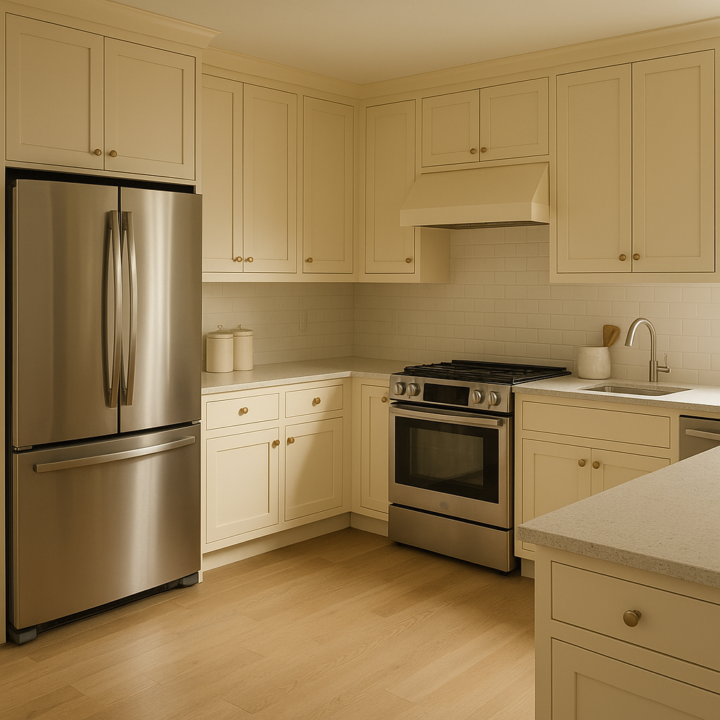
Heartsmere’s versatility makes it suitable for a variety of applications, both residential and commercial. Here are some ideas for incorporating this timeless hue into your designs:
Create a refined yet cozy atmosphere by using Heartsmere as the main wall color. Pair it with plush furnishings in off-white or gray tones and accent with metallic finishes like brushed gold or bronze for a touch of glamour.
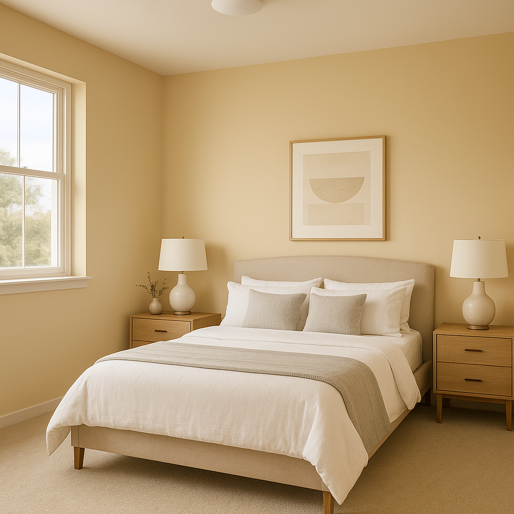
Heartsmere is an excellent choice for bedrooms, where its soft warmth promotes relaxation and tranquility. Layer it with textiles in muted greens or creamy whites to create an inviting retreat.
For a professional yet welcoming workspace, Heartsmere offers the perfect neutral backdrop. Use it with darker furniture and pops of greenery to inspire focus and creativity.
Elevate your dining experience by pairing Heartsmere with rich wood tones, such as walnut or mahogany. Add warm lighting fixtures to highlight the taupe’s undertones and create an intimate ambiance.
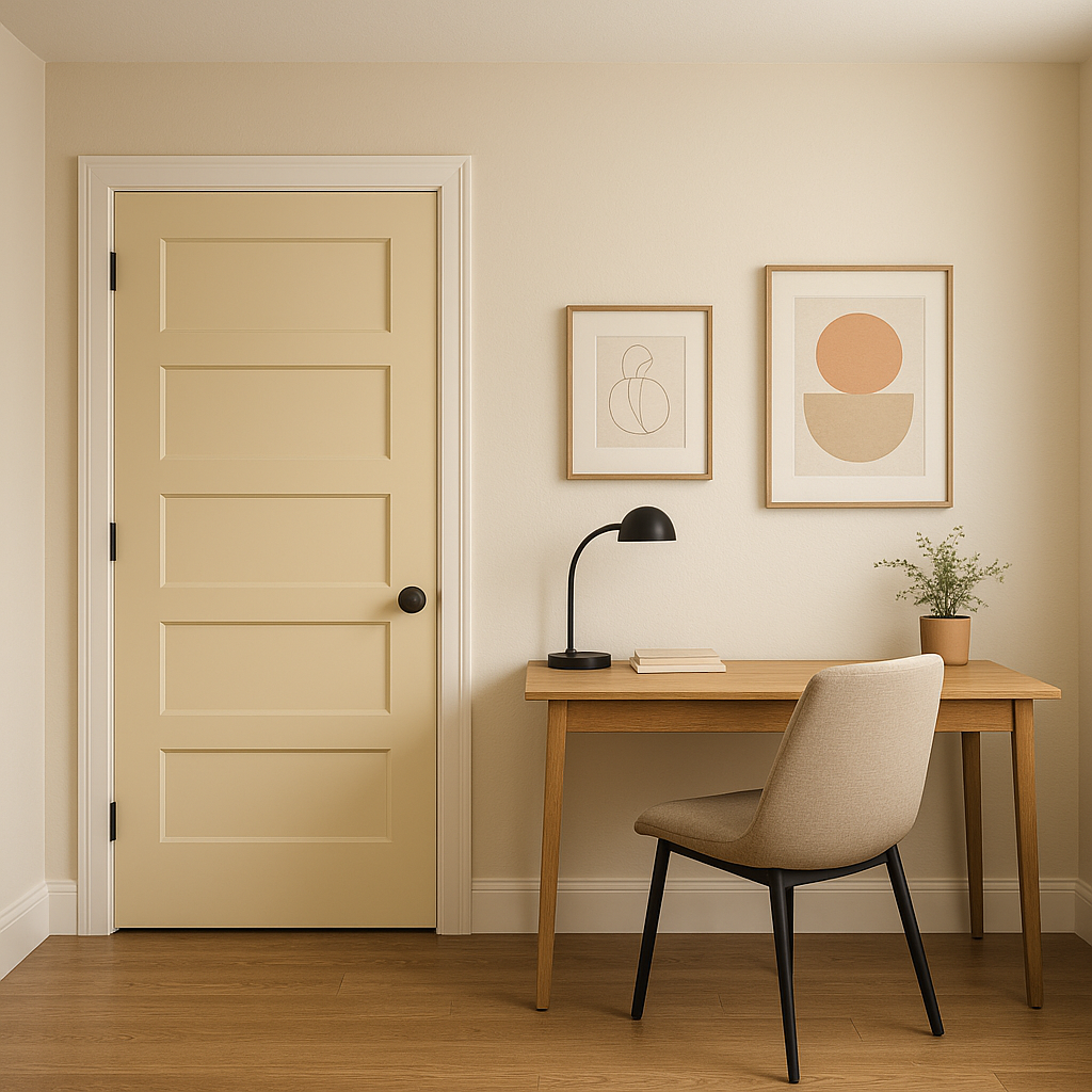
Heartsmere works beautifully in transitional spaces like hallways and entryways. Its neutral tone ensures a seamless flow between rooms while setting an elegant tone for the home.
Benjamin Moore Heartsmere (1114) is a perfect choice for anyone who appreciates subtle sophistication. Its balanced undertones and versatility make it suitable for both small and large spaces, blending seamlessly with a wide range of design styles. Whether you're refreshing a single room or reimagining an entire home, Heartsmere offers the timeless appeal of a neutral with just the right amount of personality to make your space feel uniquely yours.
Bring Benjamin Moore Heartsmere (1114) into your next project and experience the transformative power of this elegant taupe.
View Colors Only by Brand (No Imagery):
Sherwin-Williams
|
Benjamin-Moore
|
Behr
|
Valspar
Live on the Eastern Slope of Colorado and looking for a local painting professional, check out all our painting services and reach out for a free estimate.
Copyright © 2026 : Wild Fox Painting Inc. : 12435 Mead Way, Littleton, CO 80125


