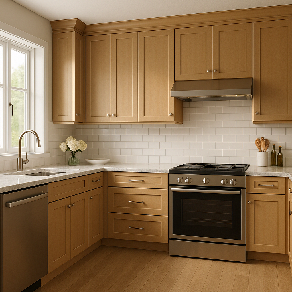
Benjamin Moore Maple (1057) is a versatile and inviting shade that exudes warmth and comfort. Perfect for creating cozy interiors, this color sits at the intersection of beige and tan with subtle golden undertones, making it a timeless choice for both traditional and contemporary spaces. Its understated elegance allows it to serve as a neutral base or a soft accent, effortlessly complementing a range of palettes and design styles.
The defining undertone of Maple (1057) is a gentle golden hue, which lends the color its warm, welcoming appeal. Unlike cooler neutrals that lean toward gray or greige, this shade radiates a soft, sunlit warmth, ensuring that spaces feel inviting rather than stark. The golden undertones pair beautifully with natural materials, such as wood or stone, enhancing the organic feel of a room.
Maple (1057) also has a faint earthy quality that grounds it, making it an ideal choice for rooms with a relaxed, lived-in vibe. These undertones help to balance the color’s warmth, ensuring it doesn’t appear too yellow or overwhelming in any lighting condition.
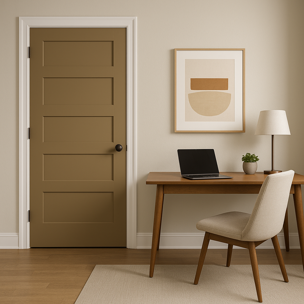
One of the standout qualities of Maple (1057) is its ability to harmonize with a wide array of colors. Whether you're aiming for a monochromatic look or complementary contrasts, this shade adapts beautifully.
Maple (1057) is highly adaptable, making it suitable for a variety of spaces and design purposes. Its warm and neutral profile ensures that it can act as a backdrop or a key player in your color scheme.
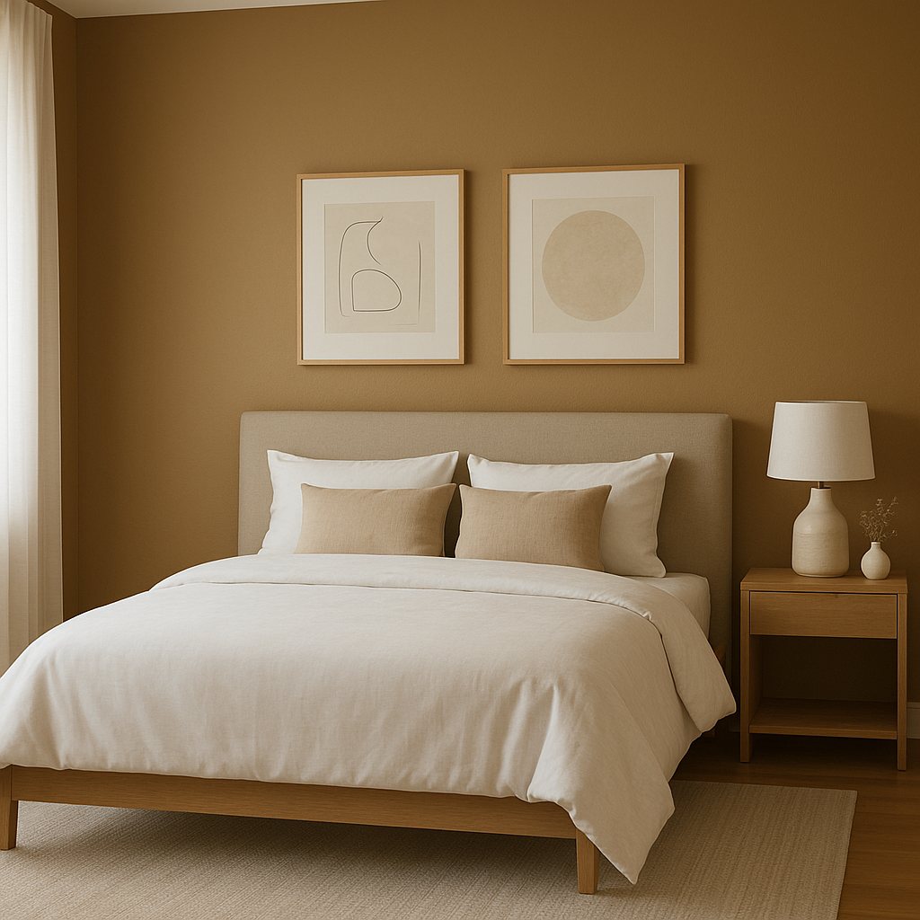
Benjamin Moore Maple (1057) reacts beautifully to various lighting conditions. In natural light, its golden undertones become more pronounced, creating a sunlit glow that enhances any space. Under artificial light, it maintains its warm and balanced profile, ensuring that rooms feel cozy and inviting at all times.
Maple (1057) is more than just a paint color—it's a design tool that brings warmth, versatility, and timeless elegance to any interior. Whether you're painting an entire room or using it as an accent, this shade adapts effortlessly to your vision, making it a reliable choice for homeowners and designers alike. With its golden undertones, wide range of coordinating colors, and suitability for various uses, Maple (1057) proves to be a standout choice in Benjamin Moore’s collection.
View Colors Only by Brand (No Imagery):
Sherwin-Williams
|
Benjamin-Moore
|
Behr
|
Valspar
Live on the Eastern Slope of Colorado and looking for a local painting professional, check out all our painting services and reach out for a free estimate.
Copyright © 2026 : Wild Fox Painting Inc. : 12435 Mead Way, Littleton, CO 80125


