Benjamin Moore Spoonful (041) is a soft, versatile neutral that brings a sense of warmth and understated elegance to any space. This creamy beige hue is perfect for creating a cozy and inviting atmosphere, whether you're designing a serene bedroom retreat, a welcoming living room, or a sophisticated dining area. Its subtle yet impactful tone strikes the ideal balance between warmth and neutrality, making it a timeless choice for interiors that radiate comfort and style.
Spoonful (041) exhibits warm undertones that lean toward a delicate golden-beige hue. This gentle warmth allows the color to feel approachable and grounded without veering into stark yellow territory. Its undertones add depth and dimension, making it an excellent backdrop for a variety of design styles, from traditional and transitional to modern and minimalist. Spoonful's versatile undertones also make it particularly well-suited for spaces with natural light, where its warmth can gently shift throughout the day, enhancing the ambiance of the room.
One of the greatest strengths of Benjamin Moore Spoonful is its ability to harmonize with a wide range of coordinating colors. For a cohesive and sophisticated palette, consider pairing it with the following complementary shades:
These coordinating colors allow Spoonful to be tailored to a variety of design aesthetics, from coastal-inspired interiors to modern rustic spaces.
Spoonful's warm and neutral qualities make it an adaptable choice for a wide range of applications throughout the home. Here are some of the best ways to incorporate this color:
Spoonful's inviting warmth creates a cozy yet refined atmosphere, making it ideal for living rooms and family spaces. Pair it with soft textures like linen or wool, and incorporate coordinating accent colors such as navy or gray for added visual interest. Its ability to work well with both light and dark furniture ensures flexibility in design choices.
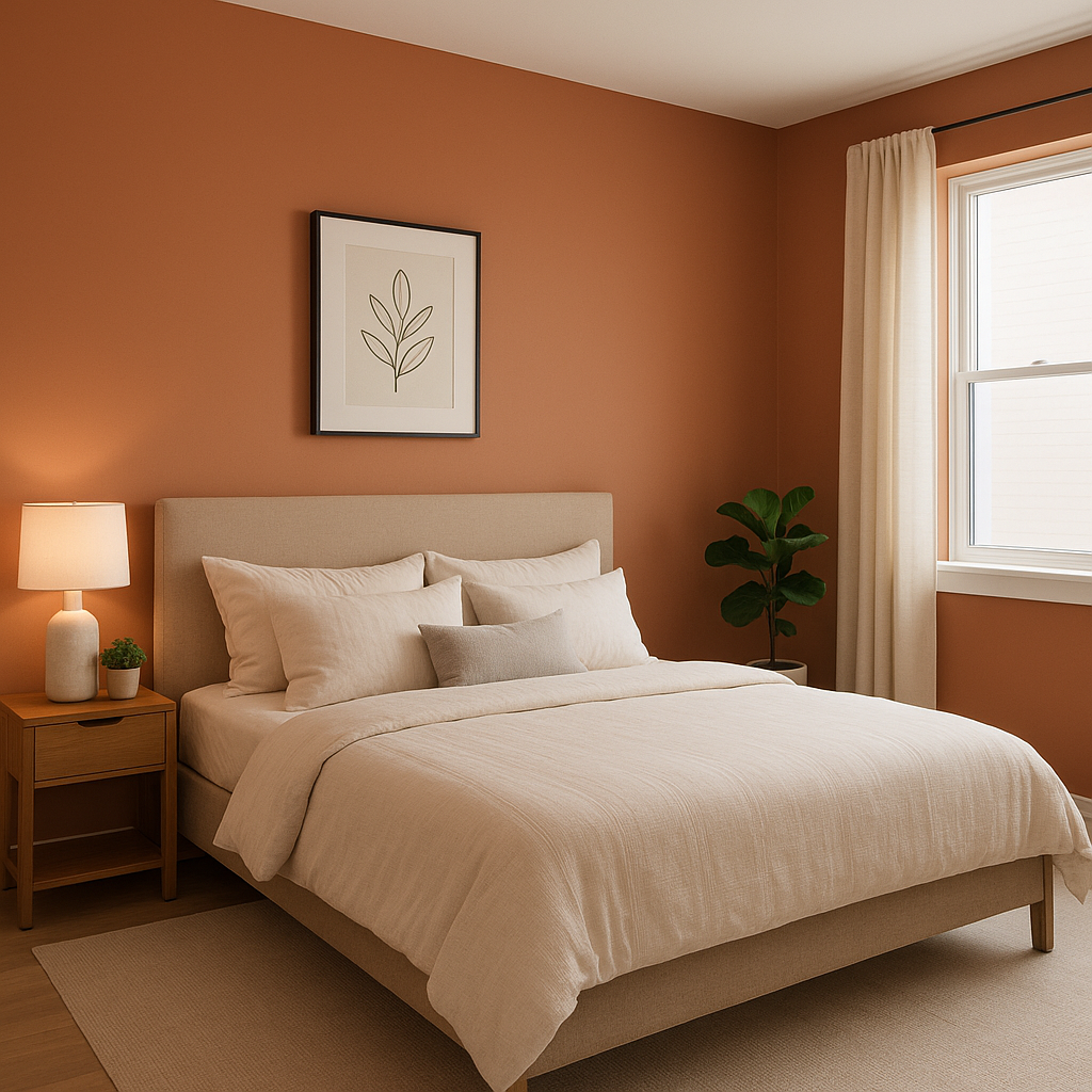
As a soothing and serene backdrop, Spoonful is perfect for bedrooms. Combine it with crisp white bedding and natural wood furniture for a tranquil, spa-like retreat. Adding soft accent colors such as pale blues, greens, or blush pinks can further enhance the space's calming vibe.
Bathrooms benefit from Spoonful's light, creamy tone, which can make smaller spaces feel larger and brighter. Pair it with white subway tiles, brass fixtures, and natural stone for a timeless and elegant look. This color is also ideal for creating a cohesive transition between bedrooms and ensuite bathrooms.
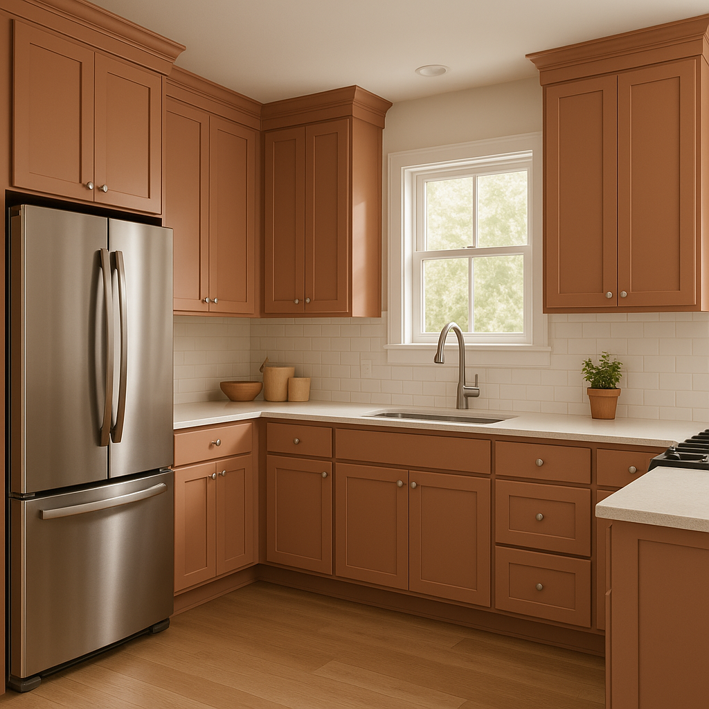
Spoonful works beautifully in kitchens and dining spaces, especially when paired with white cabinetry and warm wooden accents. It can be used on walls or even on kitchen islands for a subtle pop of color that ties the space together. This shade complements metallic finishes, such as brushed nickel or gold, for an elevated, polished appearance.
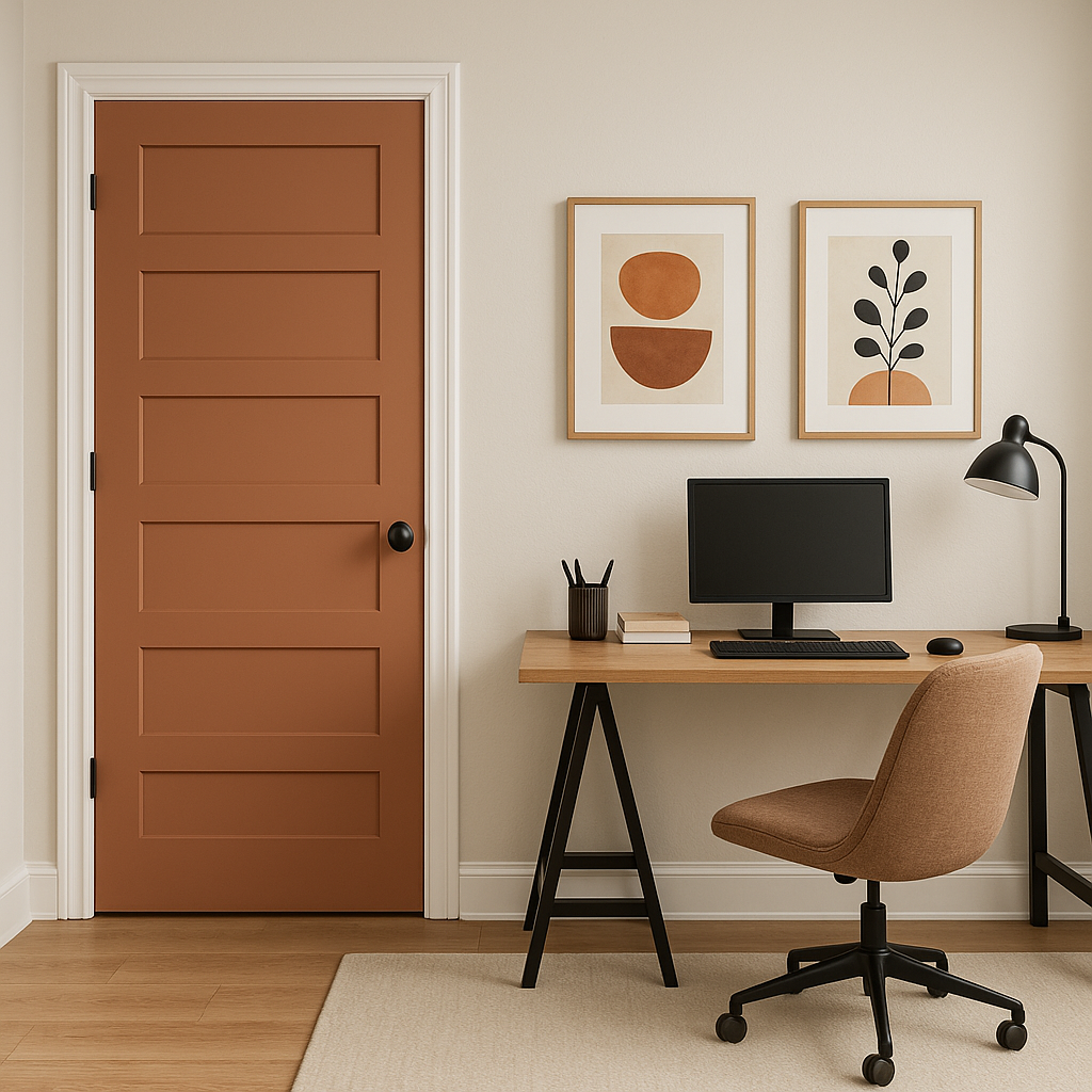
In hallways or transitional areas, Spoonful serves as the perfect neutral to connect different rooms and design styles. Its warm undertones create a sense of flow and continuity throughout the home, especially when paired with complementary colors or white trim.
Benjamin Moore Spoonful (041) is the epitome of versatility and elegance, offering a warm neutral tone that works seamlessly across a variety of design styles and spaces. Its gentle undertones, ability to pair beautifully with coordinating colors, and adaptable uses make it a go-to choice for homeowners and designers alike. Whether you're refreshing a single room or planning an entire home makeover, Spoonful provides the perfect blend of warmth and sophistication to create spaces that feel both timeless and inviting.
View Colors Only by Brand (No Imagery):
Sherwin-Williams
|
Benjamin-Moore
|
Behr
|
Valspar
Live on the Eastern Slope of Colorado and looking for a local painting professional, check out all our painting services and reach out for a free estimate.
Copyright © 2026 : Wild Fox Painting Inc. : 12435 Mead Way, Littleton, CO 80125


